Use Overlays Appropriately
Let’s take this cerulean rectangle and make it mauve with a color overlay. WHYYYYYYY?! i

Easy Does It
No bonus points for the amount of effects used. i

Be Intentional
Don’t treat the layer effects panel like a checklist; modify the default settings with care. i
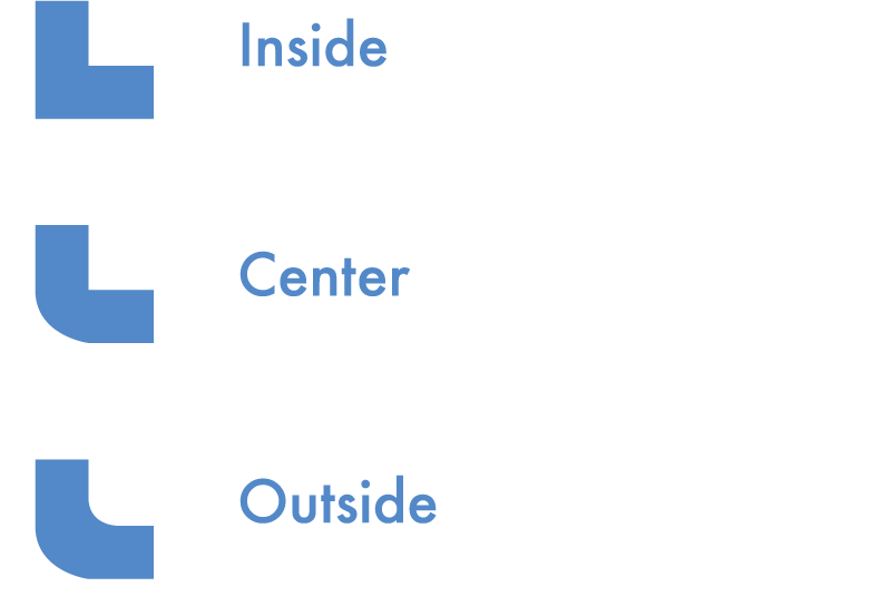
Know Your Strokes
While it’s possible you intended to have a round corner with a sharp inside, I’m guessing not. i
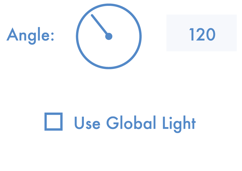
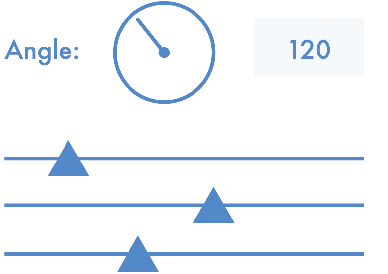
Consider Light Sources
Light coming in from 90deg. And 120deg. And 180deg. Wait, how many suns does this planet have?! i