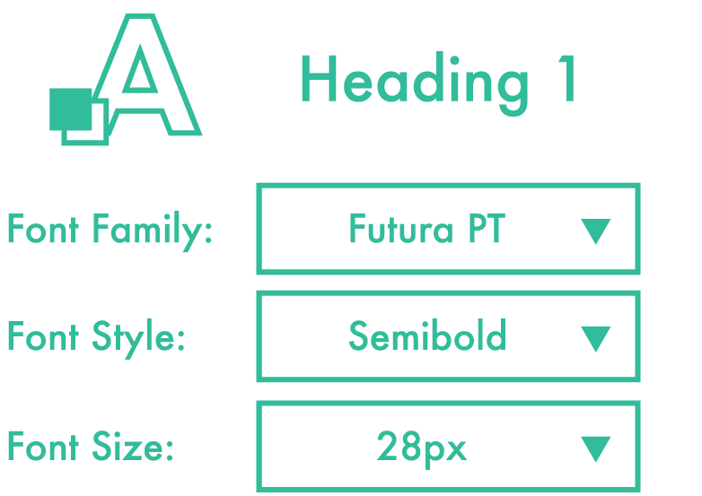
Centralize Fonts
Make every attempt to draw from the same font pool as your teammates. i

Don’t Stretch Type
Besides looking awful, there’s no easy way to do it via HTML/CSS. i

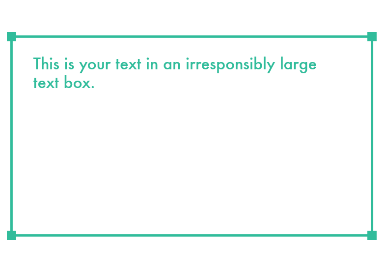
Control Your Text Boxes
Nice to see you using text-boxes. Just don’t make them 5 miles longer than the actual text. i
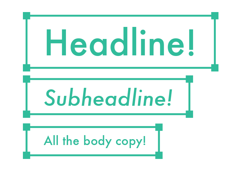
Separate Your Text Boxes
Heading? Gets its own text box. Set of paragraphs? Gets their own text box. i
Use Character Styles for Consistency
How thoughtful of you to give *every* text instance a slightly different font size. i