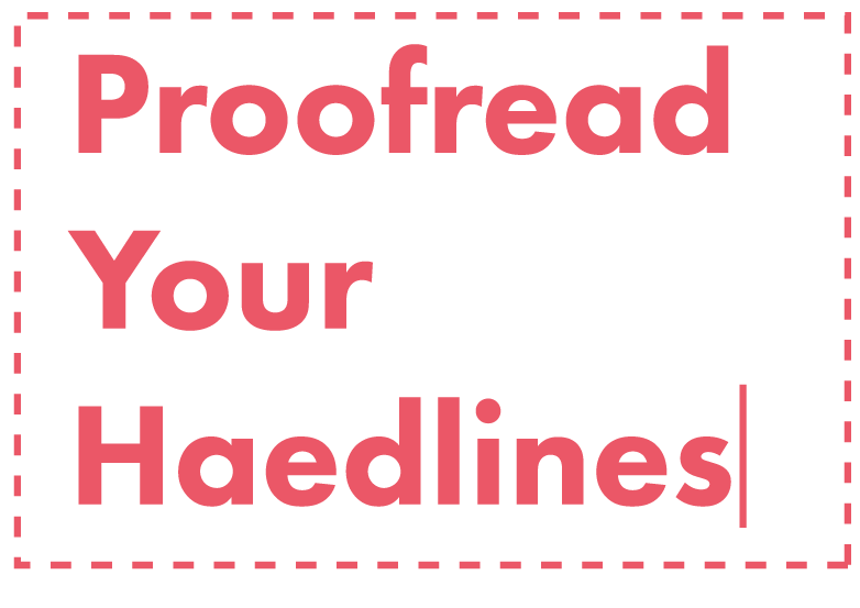
Skip to content

Chapter 6

Quality

Being “too close to a design” often means your artwork is wrought with spelling errors and potential content inaccuracies. It’s always wise to give your PSD one last check before sending it on its way.

Proofread

Get someone else’s eyes on your comp before it goes out to eyes who will undoubtedly find your grammatical mistakes. i

Proofread

Proofread

It’s easy for a designer to overlook things like misspelled headlines when they’re focused on individual pixels.

Account for all Assets

A website using watermarked stock photos is like leaving the tag on a shirt you just bought. i

Account for All ASsets

Account for all Assets

The embarrassment. Oh, the embarrassment (plus—it’s illegal). Leave a comment or documentation layer instead.

Be Familiar with Browser Compatibility

Knowing browser limitations should come standard with the “Web Design 101” package. i

Browser compatability

Be Familiar with Browser Compatibility

Browsers each render content differently, but more importantly, there are some that don’t take advantage of CSS3, or basic PNG transparency (ahem, old IE).

Consider All Screens

Tsk tsk if your comps have suffixes of “_iPhone.psd”, “_iPad.psd” and “_desktop.psd”. i

Consider All Screens

Consider All Screens

In a world of a bajillion devices, why limit yourself? The stranger, less-popular your canvas dimensions are, the more inclusive you’re being.

Be Consistent

Are you unintentionally using 3 slightly different blues? Is your red the same one as their logo? i

Be Consistent

Be Consistent

Unless intentional, it’s painstaking to have to eyedrop 10 different blues all trying to be the same value, but aren’t.